





Bubba Burger

Turning a freezer-aisle staple into a useful, craveable digital experience.
/ 01 Overview
A product website with an appetite.Working with the 5ivecanons team, I helped turn Bubba Burger’s product range, recipes, cooking guidance, and store-finding journey into one expressive, easy-to-explore experience.
/ My Contribution
Strategy: Mapped product education into clear user paths
UX: Wireframes, hierarchy, navigation, and discovery flows
UI: A responsive system rooted in the packaging and brand
Development: Interactive desktop and mobile page experiences
/ 02 The Challenge
More than a product catalog.The site needed to answer the questions that move shoppers from curiosity to confidence: what is in each burger, how should it be cooked, where can it be found, and what else can be made with it?
/ The Experience Had to
- Organize beef, turkey, veggie, and snack products clearly
- Make ingredients and nutritional information easy to find
- Surface recipes and cooking videos without dead ends
- Connect every product to a practical where-to-buy path
- Carry the same personality from desktop to mobile
/ 03 From Structure to Flavor
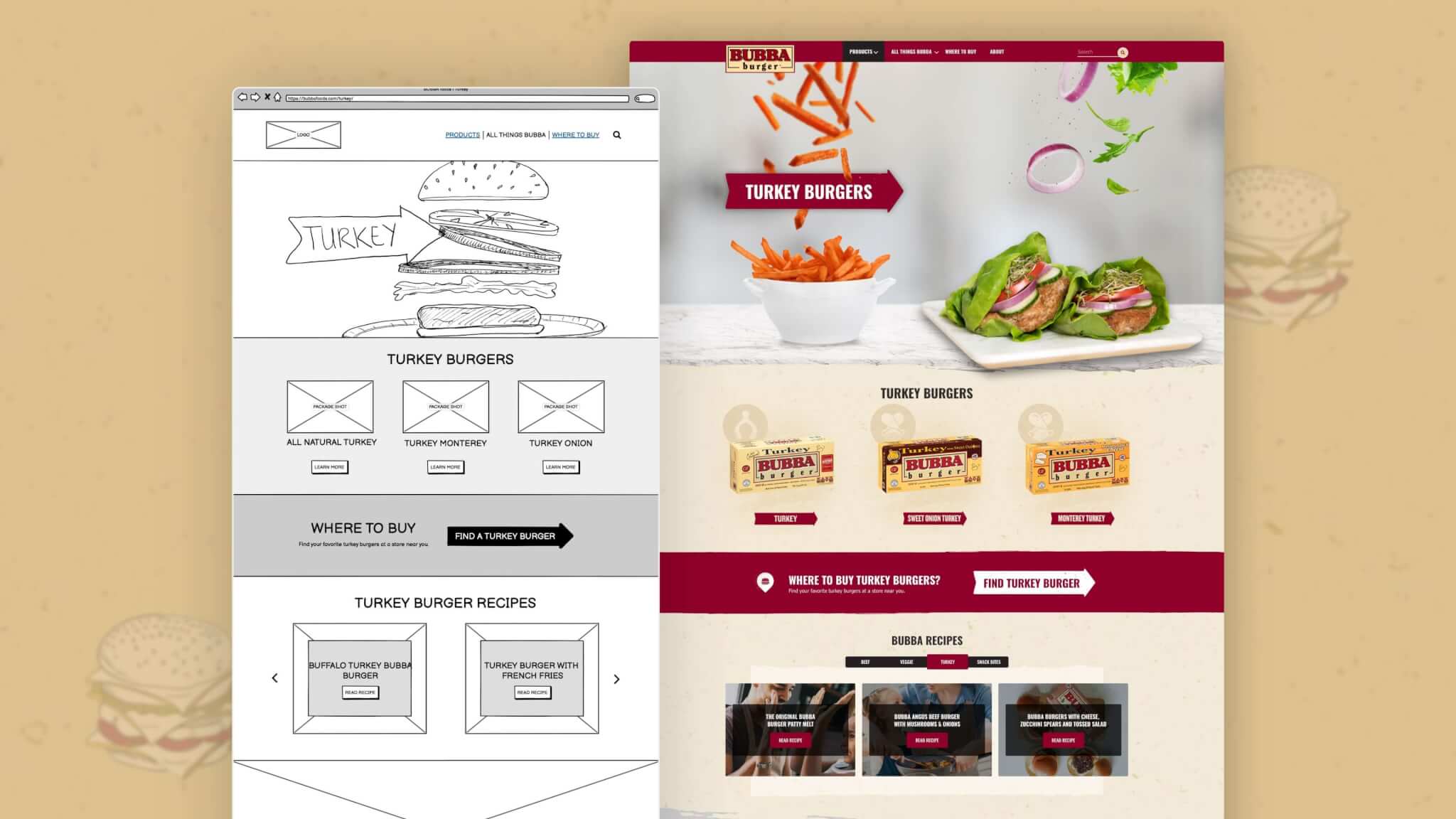
The story started in grayscale.Wireframes established a repeatable rhythm for product education, recipe discovery, related content, and store-finding before the visual layer arrived.
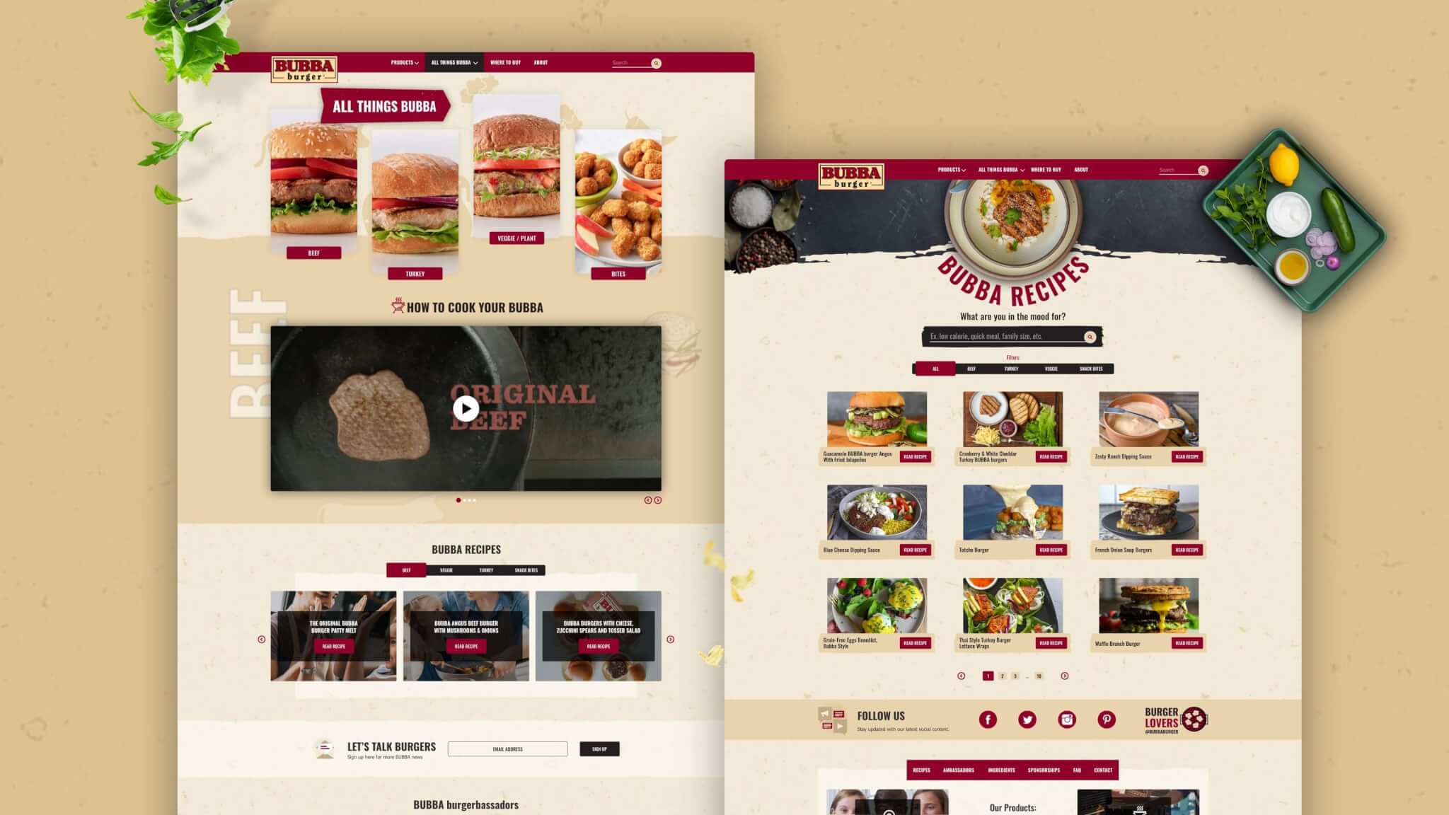
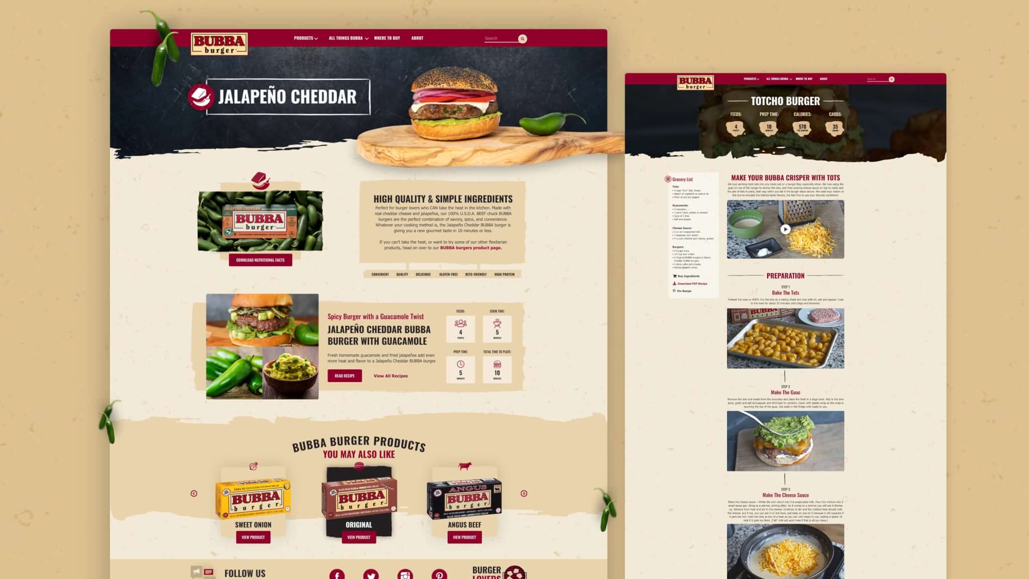
The finished interface keeps that structure visible. Strong titles, compact calls to action, product cards, and contextual links guide people deeper without making the site feel over-designed.
/ 04 A Brand You Can Navigate
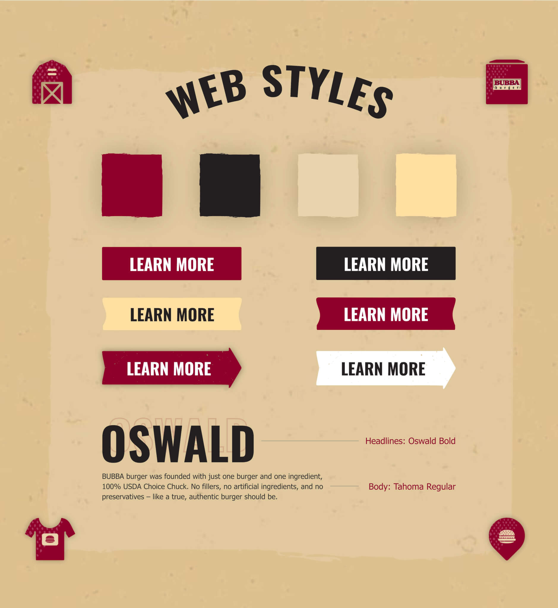
Familiar, but made for the screen.Bubba’s burgundy, charcoal, kraft-paper neutrals, condensed type, and hand-torn edges became a flexible web system.
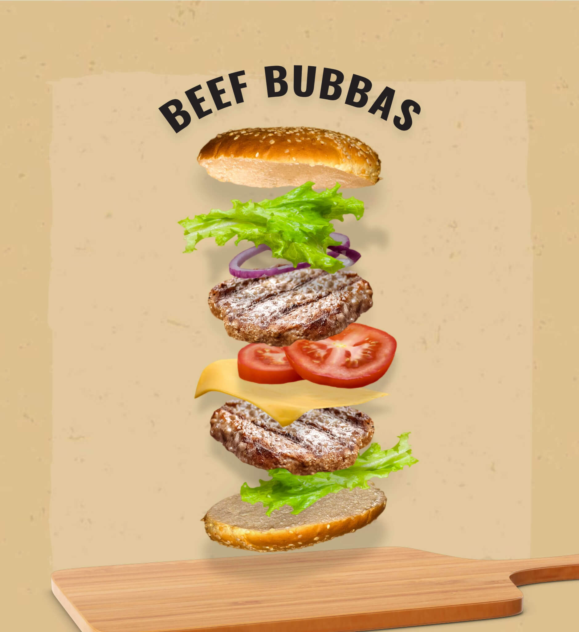
The design borrows the directness of grocery packaging while adding enough motion, texture, and food photography to make browsing feel energetic and tactile.
/ 05 Find Your Way In
Different appetites, shared system.The interface gives every visitor a natural starting point, then connects product, recipe, cooking, and purchase content.
- 01Browse by productBeef, turkey, veggie, or bites
- 02Get cooking helpSimple video-led guidance
- 03Find a recipeFilterable ideas connected to products
- 04Locate a storeA clear path from interest to purchase
/ 06 Responsive by Design
The menu becomes the product shelf.On small screens, discovery stays visual: product families remain recognizable, links stay thumb-friendly, and the brand’s personality survives the tighter canvas.
/ Mobile Priorities
- Image-led product categories at the top of navigation
- Clear hierarchy between families and individual flavors
- High-contrast search and large touch targets
- Short labels that scan quickly
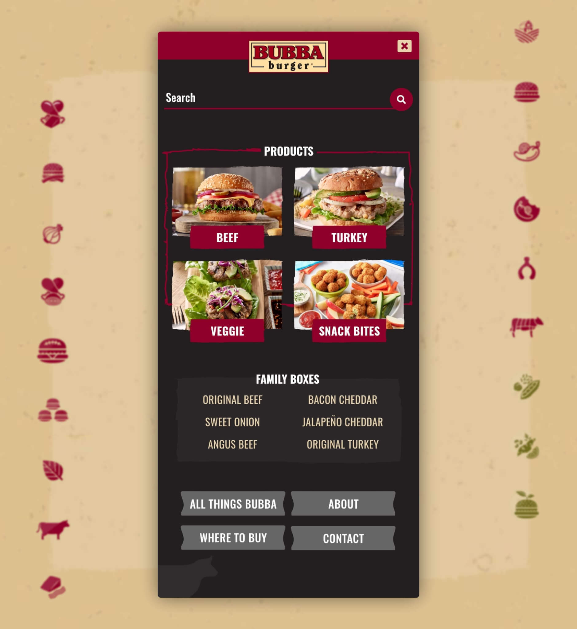
Search, scan, tap, cook.
The navigation does more than expose links. It previews the product range and gives the smallest screen a confident, useful first interaction.
/ 07 Built to Make You Hungry
Movement with a purpose.Motion helps reveal products, connect page states, and give the brand a playful physical quality without getting in the way of the information.
The final system balances appetite appeal with utility: high-impact food imagery earns attention, while consistent patterns keep the experience easy to use.
/ 08 The Outcome
A richer way to meet the brand.The redesign turned product education into an inviting journey—one that helps people browse the range, learn how to cook it, find inspiration, and move toward purchase.
/ What Changed
/ 09 Credits
Client: Bubba Burger
Agency: 5ivecanons (opens in a new tab)
My role: UI / UX Design & Web Development
Focus: Responsive Consumer Experience