


A nonprofit website and a case-management web app for the families of unsolved homicide victims.
/ 01 Overview
Project Cold Case supports families who have lost someone to an unsolved homicide. With the 5ivecanons team, the work paired a website the nonprofit can run itself with a custom web app that turns case submissions into organized, searchable records for advocates.
/ My Role
Research & flow: Site maps, user flows and wireframes for the staff web app
Interface design: Dashboard, tables, reports and the case submission steps
Website UX/UI: Homepage, donation flow, case pages and outreach
WordPress: Custom templates and the database search module
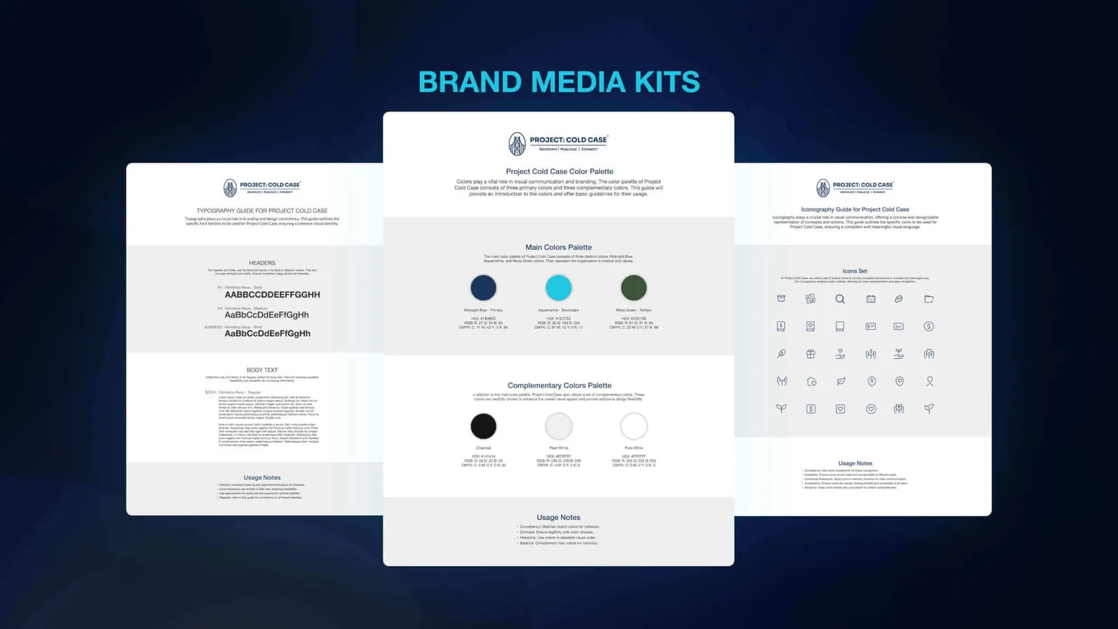
Brand system: Media kit with color, typography and iconography guides
/ 02 The Challenge
Families are thrust into investigations, courts and grief all at once. The organization needed one place to receive their stories, keep every detail together, and follow up with care over years, not weeks.
/ What Had to Work
Families
A submission process calm and clear enough to finish on a hard day.
Advocates
Victims, survivors, contacts and tasks connected in one system.
Time
Anniversaries, meetings and touchpoints that span many years.
Records
Documents, photos, meeting notes and case details kept with each profile.
The public
Spotlights and a searchable database that keep cases visible.
A small team
A website the nonprofit can update without a developer.
/ 03 Mapping the Web App
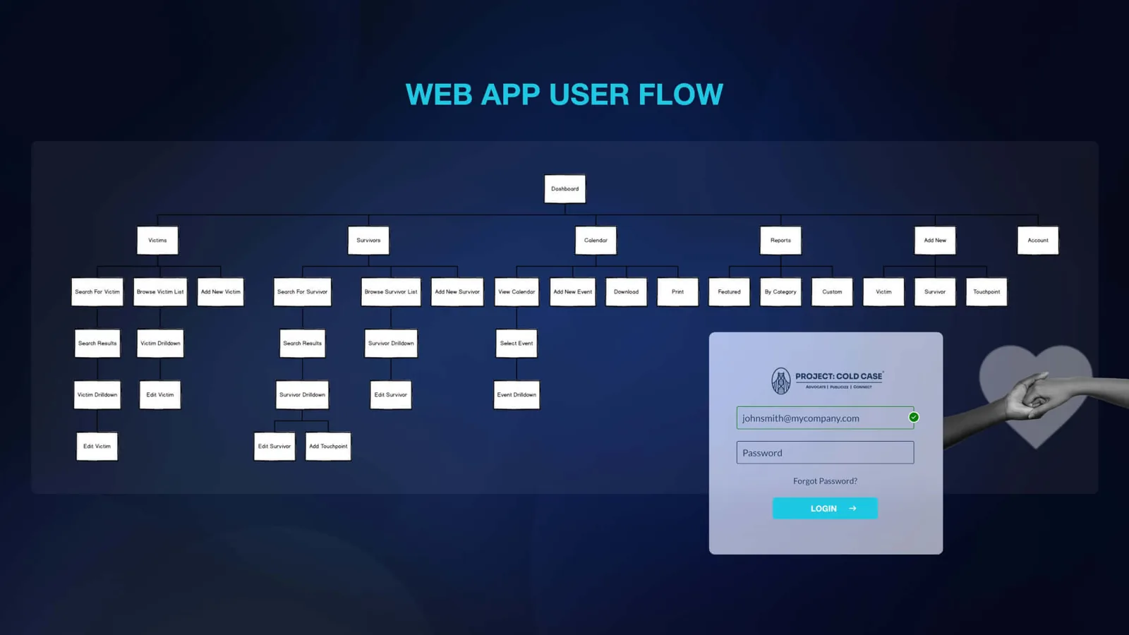
Before any screen, a map. The user flow organized the staff app around six areas: victims, survivors, calendar, reports, add new, and account. Each record opens into a drilldown with its own edit path.
/ 04 Designing for Every Outcome
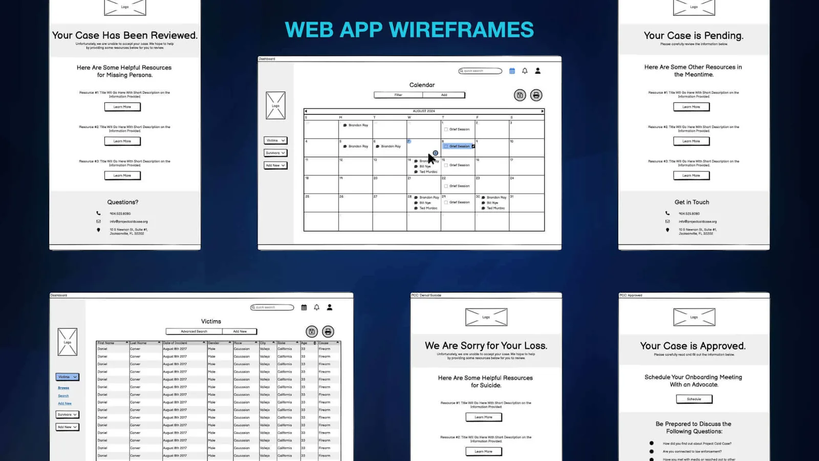
Not every submission becomes a case. The wireframes gave each decision its own page, so no family is left with a status and nothing else. Every outcome ends with resources and a way to reach a person.
- Pending
Your case is pending.
Resources to read while the team reviews the submission.
- Approved
Your case is approved.
An invitation to schedule onboarding with an advocate, and questions to prepare for.
- Reviewed
Your case has been reviewed.
When a case falls outside the mission, resources for missing persons and a way to ask questions.
- Not accepted
We are sorry for your loss.
A compassionate reply with support resources, including for suicide loss.
/ 05 A Submission in Six Steps
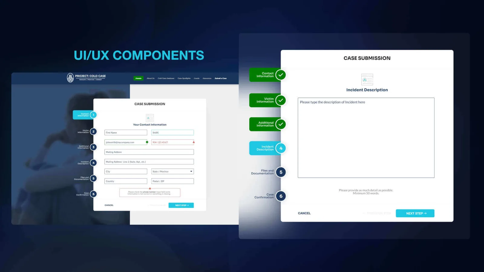
A long form, broken into steps a family can manage. Numbered steps show where you are and what is left. Fields confirm as they validate, errors explain what to fix, and the incident description asks for as much detail as a family can share.
- Contact information
- Victim information
- Additional information
- Incident description
- Files & documentation
- Case confirmation
Each submission creates a profile in the web app, where staff review, approve and follow up.
/ 06 The Staff Web App
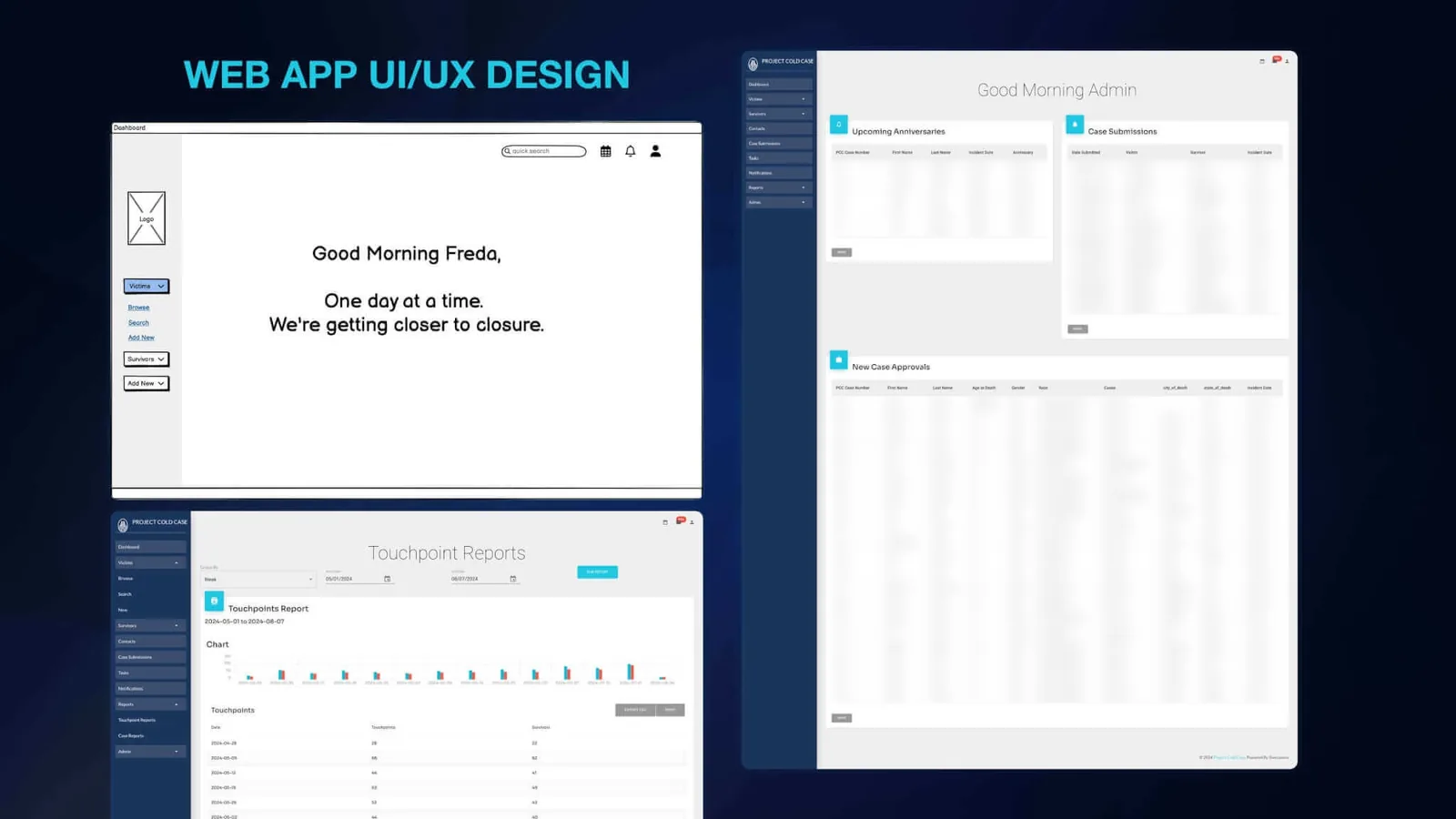
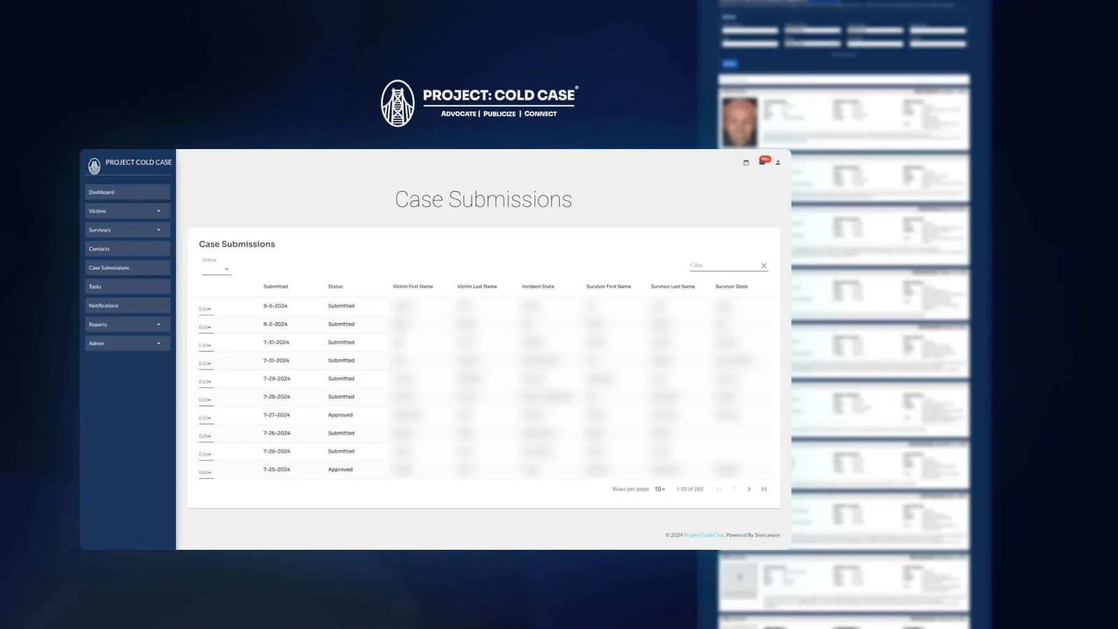
Built for advocates who carry many families at once. The interface stays quiet on purpose: a navy sidebar, plain tables and clear headings, so the attention goes to people and dates. The wireframe greeting set the tone for the whole app: “One day at a time.”
Dashboard
Upcoming anniversaries, new submissions and recent approvals at a glance.
Case submissions
A filterable queue with status, dates and an edit action per row.
Victims & survivors
Browse, search and drill into connected profiles.
Touchpoints
Every call, meeting and follow-up logged against a survivor.
Calendar
Grief sessions, meetings and anniversaries in one view.
Reports
Touchpoint reports by date range, with a chart, export and print.
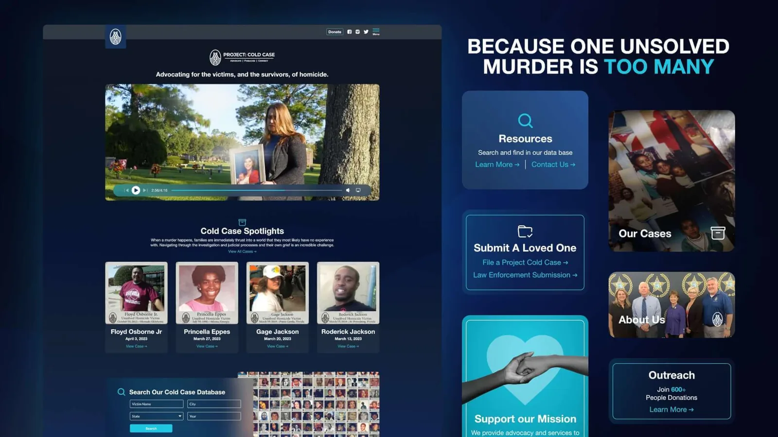
/ 07 The Public Website
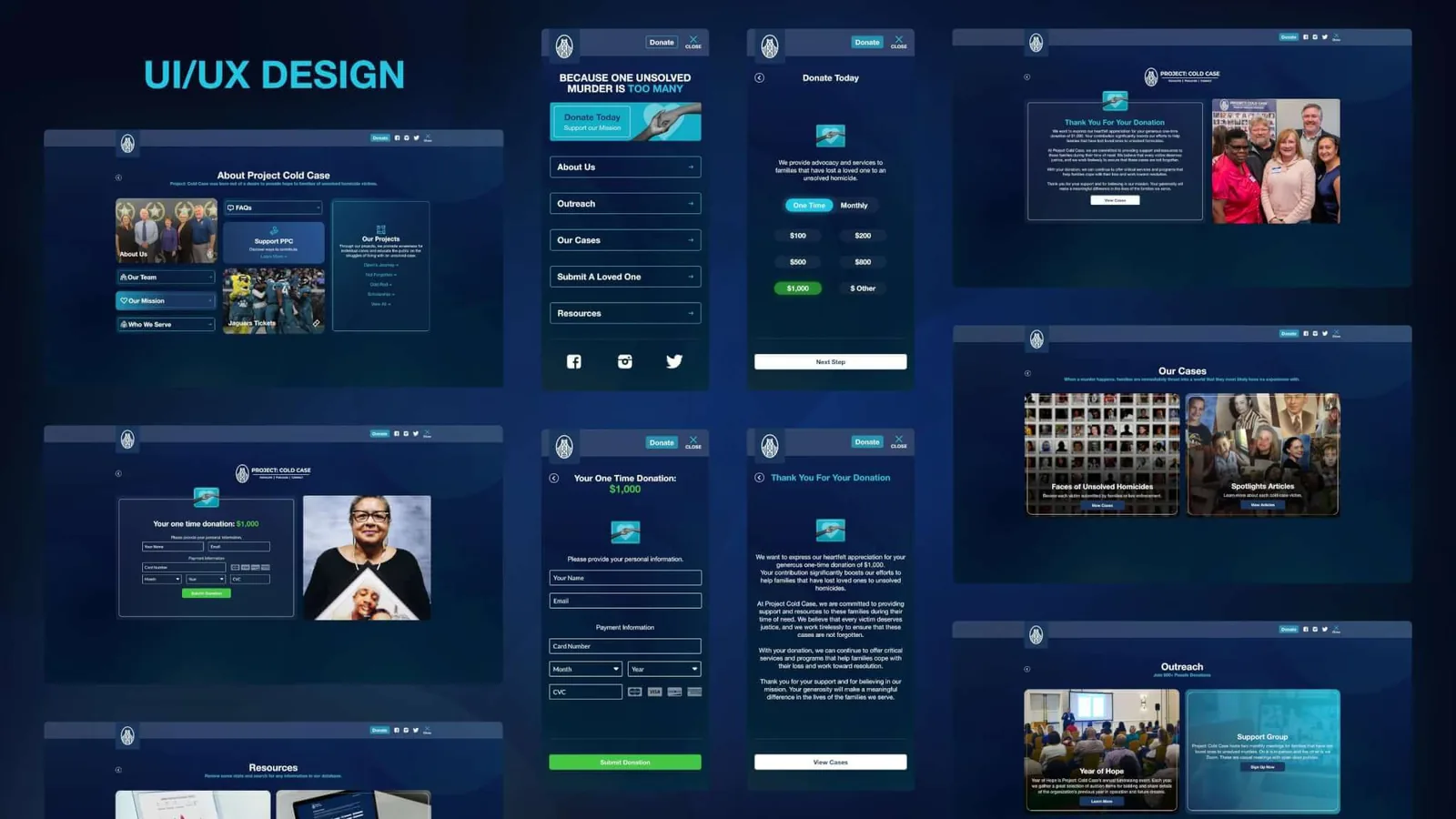
Because one unsolved murder is too many. The website carries the mission to families, donors and the public: cases and spotlights, a way to submit a loved one, resources, outreach events, and a donation flow designed for phones as well as desktop.
/ 08 Spotlights & Database Search
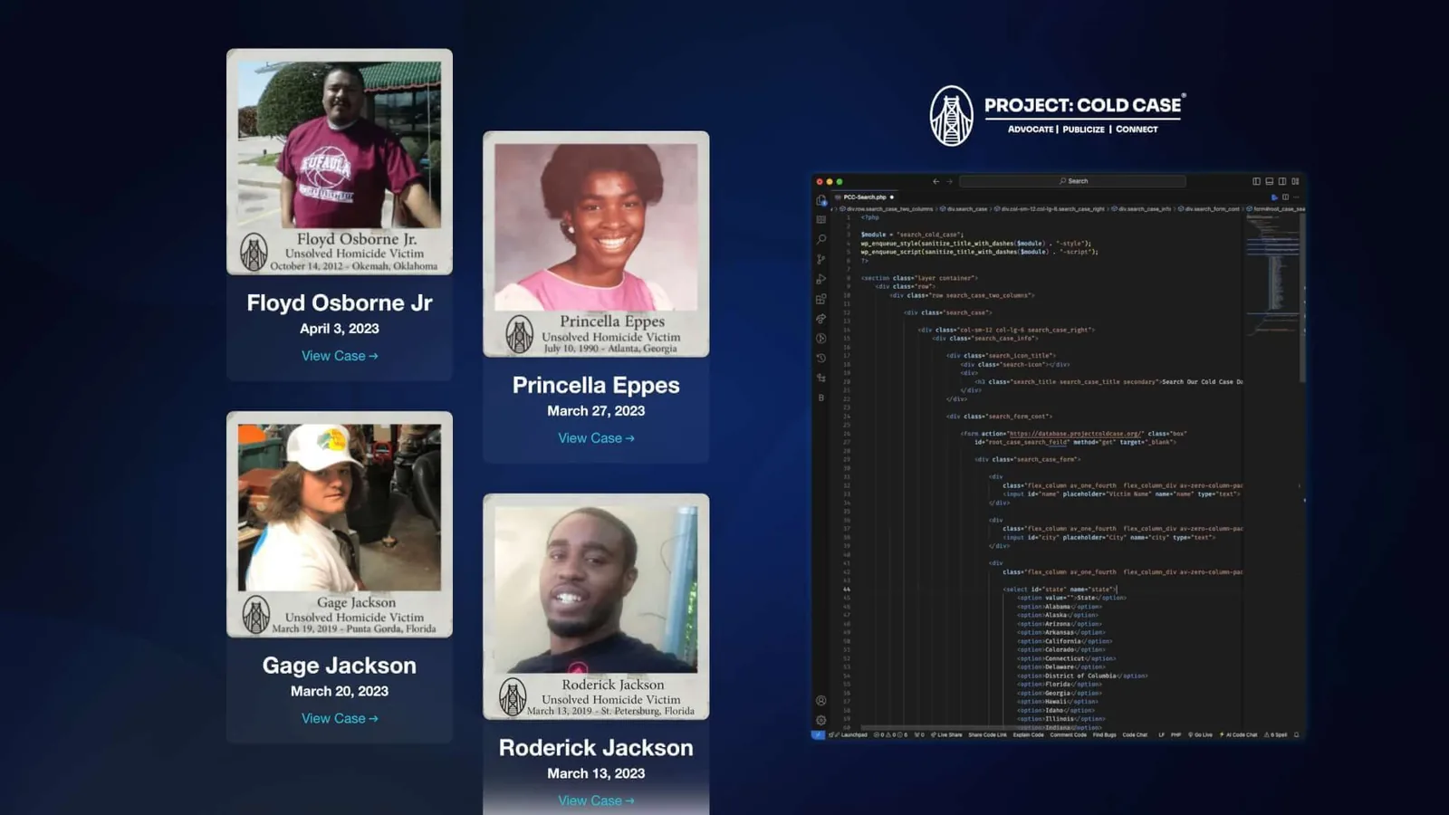
Keeping every case visible. Spotlight cards present each victim with a memorial photo, name and date, linked to the full case. A custom WordPress search module lets visitors look up cases by name, city, state or year and opens the results in the organization’s case database.
/ In WordPress
Custom modules
Sections with their own scoped styles and scripts, loaded only where used.
Search handoff
A simple form that passes the query to the database application.
Spotlights
Cards with the memorial photo, name, date and a link to the full case.
Self-managed
The team publishes spotlights, events and resources on its own.
/ 09 Brand Media Kit
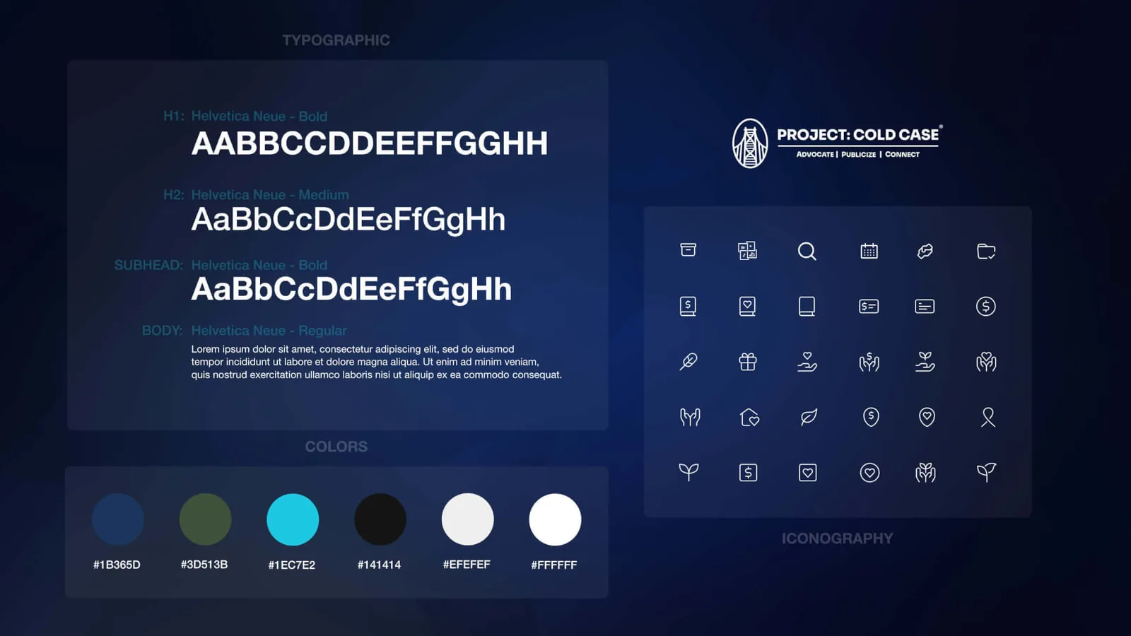
One visual language across site, app and print. A media kit set the rules: three primary colors and three neutrals, Helvetica Neue for headings and body, and a set of outline icons for giving, support, cases and events.
- Midnight Blue
- Aquamarine
- Moss Green
- Charcoal
- Pearl White
- Pure White
/ 10 Care With Sensitive Information
Every record is someone’s family. That shaped both the product and this case study.
- Case records live behind a staff sign-in, separate from the public site
- Plain, gentle language on every status page
- Resources offered with every decision, including a declined case
- The public sees only the spotlights the organization chooses to publish
- In the screens on this page, names from the admin tables are blurred
/ 11 Outcome
A system that remembers so families don’t have to repeat themselves.
- Case submissions that create individual profiles automatically
- Documents, pictures, meeting notes and social channels stored with each case
- A searchable database for the organization, law enforcement and families
- Follow-ups, anniversaries and contacts tracked over time
- A WordPress site the nonprofit manages itself
- A brand kit that keeps every channel consistent
/ 12 Reflection
5ivecanons called it the most difficult and longest project in its history. The hard part was never the tables. It was designing for people on the worst days of their lives: deciding what to ask, when to ask it, and what to say when the answer is no. That lesson stays with me in every product I design.
/ 13 Credits
Client: Project Cold Case
Agency: 5ivecanons (opens in a new tab)
My role: UX/UI Designer & WordPress Developer
Web app: Custom Ruby application with a case database
Website: Custom WordPress, managed by the nonprofit
Related services: Custom Software Development, WordPress Development
Live website: projectcoldcase.org (opens in a new tab)